Color Use in Visual Space Optimization Enhance Design Aesthetics

The Impact of Color in Design
In the realm of design, color transcends mere aesthetics; it possesses an extraordinary capacity to shape our perceptions and emotional responses. The careful selection of colors can transform an ordinary environment into a captivating experience, influencing how we interact with the space around us. Understanding the significance of color in visual space optimization can lead to enhanced design aesthetics in various settings, including residential, commercial, and public spaces.
The Emotional Resonance of Color
Colors have the unique ability to evoke a wide range of emotions and set distinct moods. For instance, warm colors, such as reds, oranges, and yellows, are often associated with energy and passion. These colors can invigorate a space, making them ideal for kitchens or workout areas, where motivation and activity are key. Conversely, cool colors like blues and greens promote tranquility and calmness, making them suitable for bedrooms and relaxation areas. This emotional resonance illustrates how intentional color choices can enhance the overall user experience.
- Enhance visibility: Bright colors can draw attention to critical elements such as signage or artworks, guiding individuals through a space effortlessly.
- Define spaces: Using different colors can create distinct zones within an open layout, promoting functional separation while still maintaining harmony.
- Influence behavior: Research indicates that environments painted in shades of blue can lower heart rates and calm minds, making them perfect for therapy rooms or clinics.
Exploring Color Categories
When analyzing color usage in design, it is crucial to consider various categories that serve specific purposes.
- Warm Colors: Colors such as red and orange can create an inviting atmosphere, encouraging interaction and engagement. Restaurants often use these palettes to stimulate appetites.
- Cool Colors: Blues and greens promote serenity and can make spaces feel larger and more open. Many corporate offices adopt these colors to foster a calm and focused work environment.
- Neutral Colors: Shades of white, grey, and beige offer a versatile backdrop, allowing for flexibility in design, especially in homes where personal styles may vary.
Balancing Aesthetics and Functionality
As designers navigate the intricate relationship between color and space, several factors come into play. How can they balance aesthetic appeal with functionality? Culturally, the perception of color can differ widely, influencing how individuals respond to certain hues. In the United States, for example, red is often associated with passion and excitement, while blue conveys trust and stability.
In conclusion, the strategic use of color profoundly impacts design, prompting us to consider how we utilize color palettes in various contexts. By delving deeper into the emotional and functional implications of color, designers can craft spaces that resonate with users and enhance their experiences, inviting further exploration into the rich tapestry of color theory and design practice.
CHECK OUT: Click here to explore more
Creating a Cohesive Visual Narrative
The application of color in design is not just an artistic endeavor; it is an essential aspect of visual space optimization that can dramatically enhance the aesthetic appeal of any environment. Designers must navigate the intricate layers of color to create a cohesive visual narrative that engages users and enriches their experiences. Each hue carries inherent meanings and implications that can guide the viewer’s perception, making understanding color relationships paramount in creating functional yet beautiful spaces.
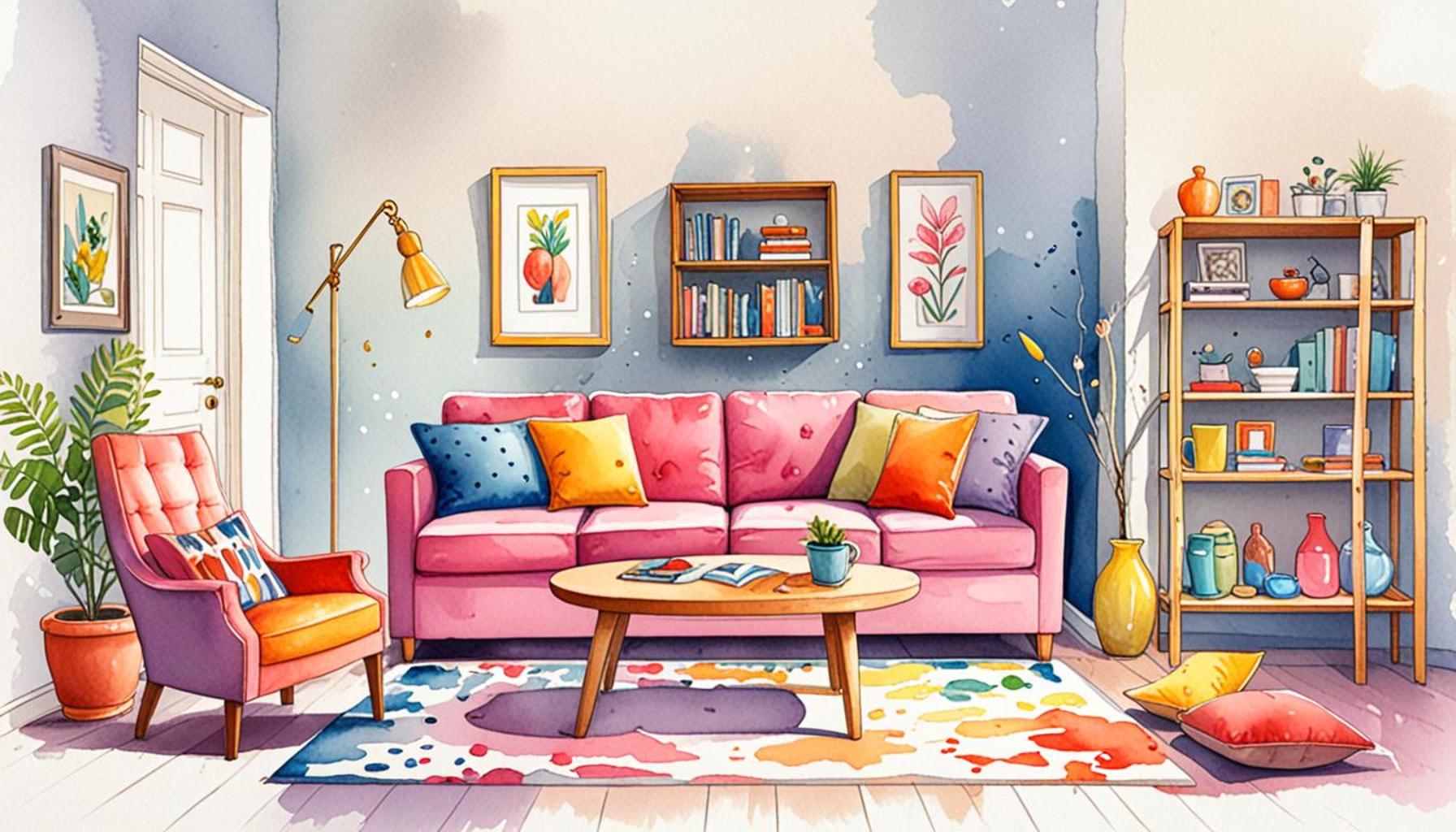
One effective approach to harnessing the power of color is the concept of color harmony. This principle asserts that combinations of colors should work together cohesively to evoke a desired feeling or atmosphere. Utilizing color harmonies, such as complementary, analogous, or triadic schemes, designers can create dynamic spaces that are visually stimulating while maintaining a sense of balance. For instance, the use of an analogous color scheme in a living room may involve varying shades of blue, green, and aqua to heighten a sense of calm without overwhelming the senses.
- Complementary Colors: When colors that sit opposite each other on the color wheel are paired, they produce vibrant combinations that attract attention. This technique is particularly effective for highlighting focal points in design.
- Analogous Colors: Groups of three colors that are next to each other on the color wheel create a serene and comfortable aesthetic, ideal for places such as nurseries or spas.
- Monochromatic Colors: Utilizing variations in lightness and saturation of a single color can result in a sophisticated and unified look, making spaces like corporate offices feel modern and clean.
The Role of Color in Spatial Dynamics
Color plays a critical role in defining spatial dynamics within an environment. Designers leverage color not only to enhance beauty but also to manipulate how we experience a space. Light colors tend to make areas feel larger and more open, while darker shades can create intimacy and warmth. Therefore, in smaller rooms, architects and interior designers commonly opt for lighter palettes to create an illusion of space. Conversely, utilizing darker tones in expansive areas can foster a sense of coziness.
Moreover, the strategic distribution of color can guide movement throughout a space. For example, in educational institutions, vibrant primary colors might be used in specific zones to stimulate energy and creativity, while neutral tones can be interspersed to allow for periods of concentration and calm. Effective color placement is an invaluable tool to enhance the user experience by subtly influencing behavior and encouraging the desired interactions within the environment.
As we continue to explore the vibrancy of color within design, it becomes evident that the intricate dance between color use and visual space optimization is not merely an aesthetic choice; it is a vital component in crafting spaces that not only look appealing but feel engaging, functional, and purposeful.
| Category | Details |
|---|---|
| Color Psychology | Colors evoke emotions and influence user behavior, making them crucial for engagement. |
| Space Perception | Optimized color palettes can create illusions of depth, enhancing spatial awareness in design. |
| Visual Hierarchy | Strategic color contrasts guide users’ eyes to important elements, prioritizing information delivery. |
| Aesthetic Appeal | Pleasant color combinations create a positive user experience, impacting overall satisfaction and retention. |
Amidst the plethora of design elements, the strategic use of color stands out as a vital component for enhancing visuals and optimizing functionality in spaces. Color psychology plays a critical role in conveying emotions; it effectively guides user decisions and overall engagement. For instance, warm colors can invoke excitement, whereas cool tones tend to promote calmness, enriching the interaction between users and visual spaces. Moreover, the perception of space can be cleverly manipulated through color choices. By employing lighter shades, designers can create an illusion of openness, while darker hues can suggest intimacy. This element is paramount in digital design, where spatial awareness can directly influence how users interact with content. Establishing a solid visual hierarchy is also pivotal; color contrasts can lead users’ attention toward essential navigation elements, ensuring that critical information is prominently displayed. Ultimately, the aesthetic appeal created by thoughtful color combinations significantly enhances user satisfaction, leading to increased retention and interaction with the design.
CHECK OUT: Click here to explore more
Emotional Resonance and Color Psychology
The relationship between color and human emotions is profound and widely recognized. Understanding color psychology allows designers to craft environments that resonate on an emotional level. Different colors evoke unique responses; for instance, red can stimulate excitement or urgency, while soft yellows and greens may induce feelings of tranquility and serenity. By carefully selecting colors, designers can enhance design aesthetics while simultaneously guiding the mood and energy of a space.
This emotional resonance is particularly essential in spaces like healthcare facilities and schools where the psychological comfort of users is paramount. Research indicates that color choices in a hospital setting can influence patient recovery rates. For example, green is often used in recovery rooms due to its calming effect. Similarly, warm hues like peach or cream create a welcoming atmosphere in waiting areas, alleviating patient anxiety. The strategic use of color not only beautifies but also facilitates a sense of well-being in such crucial environments.
Creating Visual Hierarchy Through Color Application
Another essential aspect of utilizing color in design is the establishment of visual hierarchy. By assigning different colors to various elements within a space, designers can create a structured visual flow that directs attention to focal points. Utilizing bold colors on key features, such as accent walls or artwork, draws the eye and establishes a clear path for movement and interaction. In contemporary office designs, for example, bright colors may mark collaborative spaces, while muted tones dominate workstations, clearly delineating areas of high energy from zones of concentration.
Furthermore, the application of color can also serve functional purposes in spatial optimization. In commercial environments, color coding can enhance navigation, such as using specific colors for restroom signage or emergency exits. This practice not only meets safety regulations but also contributes to a cohesive aesthetic design that feels both intuitive and engaging for customers and employees alike.
The Cultural Implications of Color in Design
It’s worth noting that the interpretation of color can vary significantly between cultures. Designers in the United States must be mindful of these differences, especially as demographics become more diverse. For example, while white is often associated with purity and peace in Western cultures, it can embody mourning in some Eastern traditions. Awareness of these cultural implications allows designers to create inclusive spaces that resonate with their intended audience, highlighting the importance of cultural context in color use in visual space optimization.
As we delve deeper into the multifaceted intersection of color and design, it becomes increasingly clear that color is a versatile tool that transcends mere aesthetics. Instead, it serves as a vehicle for emotional connection, functional design, and cultural sensitivity. This rich tapestry of color application in design not only enhances visual appeal but also transforms spaces into places where users feel understood, engaged, and inspired.
SEE ALSO: Click here to read another article
Conclusion
In summary, the strategic use of color in visual space optimization emerges as a dynamic tool that profoundly impacts design aesthetics and user experience. From evoking specific emotional responses to forming effective visual hierarchies, the interplay of color within a space engages individuals on multiple levels. As explored throughout this article, understanding color psychology not only enhances the beauty of an environment but also fosters a sense of safety, comfort, and belonging, particularly in sensitive settings such as hospitals and educational institutions.
Moreover, the practical applications of color—such as navigation aids in commercial spaces or the cultural nuances that inform design choices—emulate the complexity of our society. By considering cultural implications and the diverse perceptions associated with color, designers can create more inclusive environments that resonate deeply with varied audiences. Innovative practices in color application can lead to enhanced usability and aesthetic cohesion, contributing to a holistic experience for users.
As the field of design continues to evolve, the role of color in shaping our environments remains vital. Finding the balance between aesthetic appeal and functional effectiveness will undoubtedly challenge and inspire designers to push creative boundaries. This underscores the importance of continual exploration and research into color theory and its applications. Ultimately, delving deeper into color use in visual space optimization opens doors to fresh insights and extraordinary possibilities, inviting individuals to not only inhabit spaces but to experience them in meaningful ways.


